Conversion Rate Optimization
Best Call to Action Buttons for Ecommerce Landing Pages in 2024

Author
Mark M.
Published
June 19, 2024
Reading Time
9 min
In the bustling world of ecommerce, a well-crafted CTA (Call-to-Action) can be the golden ticket to soaring sales and engaged customers. As we step into 2024, the rules of engagement have slightly evolved, making it crucial to adapt and optimize your CTAs to not just meet but exceed expectations. Ready to transform your landing pages? Let's dive into the strategies that will make your CTAs irresistible.
What You’ll Gain From This Article:
Enhanced Understanding: Grasp why CTAs are essential for ecommerce success.
Actionable Insights: Learn precise techniques to craft compelling CTAs.
SEO Integration: Discover how to naturally weave in keywords for better visibility.
Practical Examples: See real-world examples of effective CTAs.
1. Simplify and Declutter: The Power of Minimalism
First impressions matter, and a cluttered landing page can overwhelm visitors. Simplify and declutter your layout to make your CTA the focal point.
Prominent Placement: Center your CTA or place it where the eye naturally falls.
Singular Focus: Avoid multiple conflicting CTAs on one page. One clear message trumps several confusing ones.
Example: Use "Shop the Collection" rather than having "Shop Now," "View More," and "Explore Deals" all on one page.
2. Strong Verbs and Contrasting Colors: Command Attention
Words are powerful, especially in ecommerce. Incorporate strong verbs and ensure your CTA button stands out visually.
Strong Verbs: Use action-oriented language like "Sign Up for Free" or "Buy Now."
Contrasting Colors: Choose colors that contrast with your background but mesh well with your brand palette. Bright buttons usually catch the eye.
Example: "Get Your Free Trial" in a bold, contrasting color like orange or red against a neutral background.
3. Create a Sense of Urgency: Don’t Wait—Act Now!
Humans are naturally inclined to act when they feel a sense of urgency.
Limited-Time Offers: Highlight promotions with phrases like "Limited Time Offer" or "Hurry, Sale Ends Soon."
Countdown Timers: Incorporate timers to visually represent the urgency.
Example: "Exclusive 24-hour Flash Sale—Shop Now!"
4. Mobile-Friendliness: Embrace the Mobile Shopper
With an increase in mobile shopping, your CTAs must be mobile-friendly.
Accessible CTAs: Ensure buttons are easily tappable and not too small.
Responsive Design: Make sure your site adapts to any screen size seamlessly.
Example: "Tap to Redeem" with larger buttons designed for thumb use.
5. Social Proof and Trust Signals: Build Credibility
In the digital age, trust is currency. Elevate your CTAs with social proof and trust signals.
Testimonials and Reviews: Display customer experiences and ratings near your CTA.
Security Badges: Highlight secure payment options and money-back guarantees.
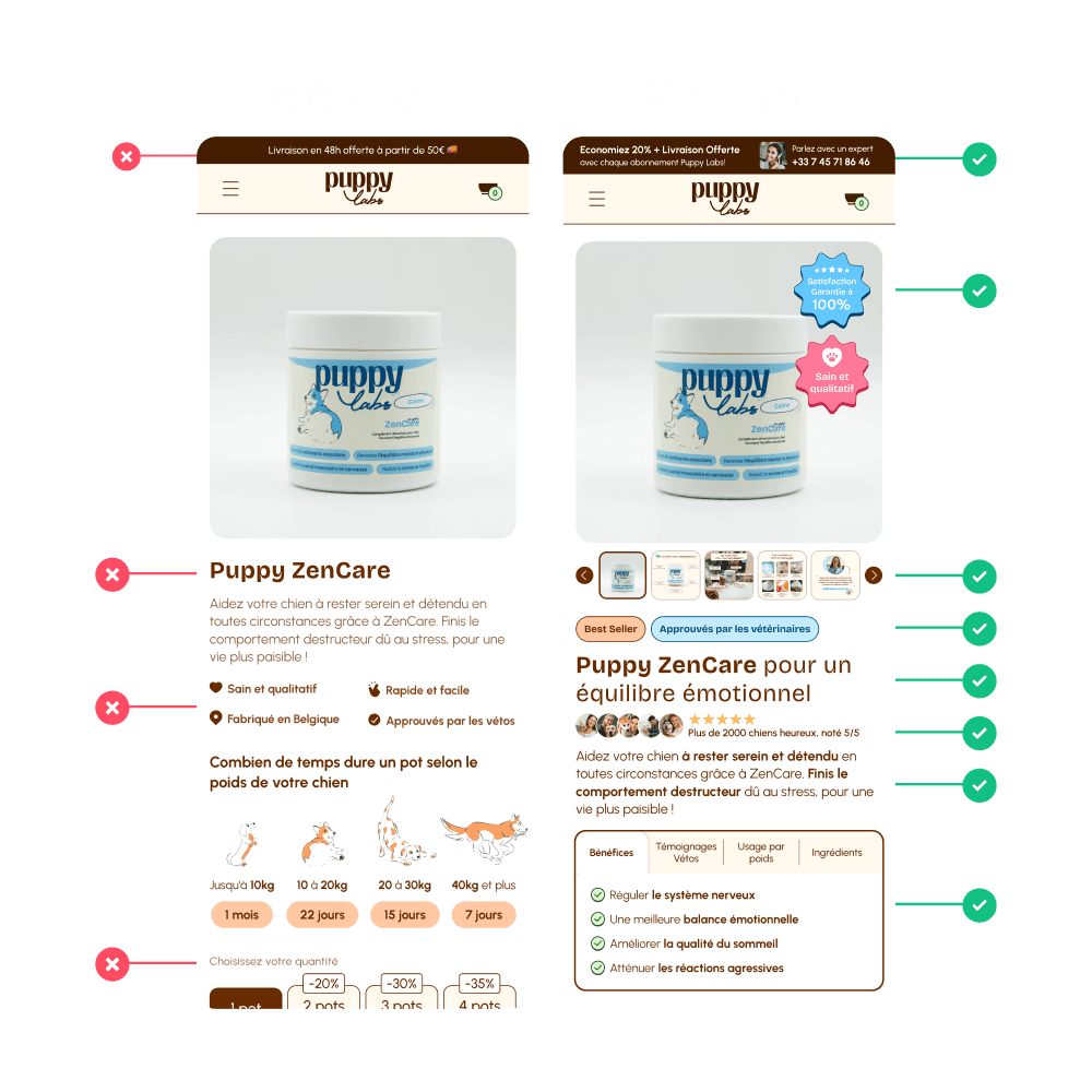
Example: Beside "Add to Cart," include "Trusted by 1,000+ Happy Customers" and a security badge.
6. Clear Value Proposition: Highlight the Benefits
Your CTA should scream value. What makes your offer unique?
Unique Selling Proposition (USP): Clearly state what sets your product apart.
Benefit-Driven Language: Emphasize how taking action will benefit the user.
Example: "Get 50% More Storage—Upgrade Now!"
7. Repeating the CTA: Keep It Top of Mind
Especially on longer pages, a single CTA might get lost. Repeating the CTA ensures consistent focus.
Frequent Reminders: Place CTAs at the beginning, middle, and end of your content.
Varied Formats: Use buttons, text links, and banners.
Example: "Shop Now" button at the top, mid-content text link, and an end-of-page banner repeating the offer.
8. Actionable Language: Drive the Point Home
The language you use must inspire immediate action.
Concise and Clear: Avoid ambiguity. Phrases like "Get 50% Off Today" or "Buy Now and Save" work wonders.
Personalization: Address the visitor directly if possible. "Your Exclusive Offer Awaits!"
Example: "Claim Your Discount Today!"
Conclusion: Key Takeaways for 2024
The art of crafting effective CTAs encompasses clarity, urgency, and trust. By integrating strong verbs, eye-catching colors, a sense of urgency, mobile-friendly designs, social proof, a clear value proposition, repeated prompts, and actionable language, your ecommerce landing pages will not just attract visitors but convert them into loyal customers.
Implement these strategies, and watch your conversion rates soar in 2024! Remember, every click counts—make sure each CTA is designed to engage and drive action.